Font Design Fundamentals for Clear and Effective Communication
Typography shapes how information is read and understood, and font design sits at the heart of that process. Font designers create the visual voice of text—defining proportions, spacing, and the subtle features that influence legibility, tone, and brand identity. This article explains what font design involves, how typography and text interact, practical decisions around serif choices, and how to integrate type into broader design work for print and digital projects.

What are fonts and how do they differ?
A font is a specific style and weight of a typeface family—the concrete file or set of glyphs you use to render letters on screen or paper. Typefaces are collections of related fonts (for example, regular, bold, italic). Differences between fonts include stroke contrast, x-height, character width, and the presence or absence of serifs. These attributes affect readability at different sizes and contexts. Understanding these differences helps designers choose fonts that support hierarchy, clarity, and the emotional tone of a message.
How does typography influence perception?
Typography organizes text so readers can scan, comprehend, and emotionally respond to content. Choices such as letterspacing, line height, and alignment influence legibility and rhythm. Hierarchical elements—headlines, subheads, captions—are created by varying font sizes and weights. Good typography balances function and aesthetics: it ensures text works across devices, supports accessibility (contrast, readable sizes), and aligns with brand personality. Poor typographic choices can make even accurate content feel confusing or untrustworthy.
How can text layout improve legibility?
Text layout decisions—column width, line length, leading (line spacing), and paragraph spacing—directly affect how easily readers process content. Narrow columns aid scanning; longer lines suit immersive reading but need increased leading. Attention to characters per line (roughly 45–75 for comfortable reading) and hierarchical spacing helps guide the eye. For multilingual or technical content, consider glyph support and punctuation spacing. Test layouts at typical reading sizes and across devices to ensure the intended flow and clarity of the text.
What are the main steps in typeface design?
Typeface design typically starts with research and concept: defining the intended use, historical references, and target language support. Designers sketch letterforms, establish a consistent visual system (proportions, stroke modulations, terminals), and build key characters first—often H, O, n, e—to set metrics. Digital production includes spacing (sidebearings), kerning pairs, hinting for low-resolution screens, and exporting into font formats (OTF, TTF, variable fonts). Iterative testing across sizes and contexts ensures the final fonts balance legibility, personality, and technical compatibility with platforms and layout engines.
When should you choose a serif style?
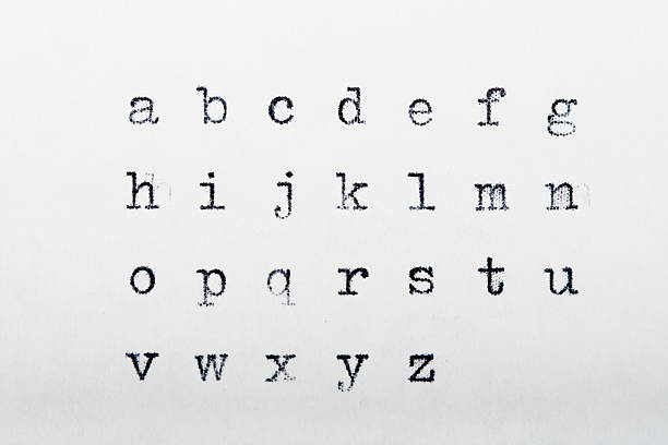
Serif fonts—typefaces with small strokes at the ends of letterforms—often convey tradition, formality, or high readability in long-form print. They can improve horizontal reading flow by subtly linking letters, which is why many books and newspapers use serif faces. In digital contexts, serifs can still be effective for body text at sufficient sizes and with good rendering; however, sans-serif options are frequently preferred for small on-screen text or minimalist design systems. The choice should be driven by readability needs, brand voice, and the medium where text will appear.
Conclusion
Font design combines artistic judgment with technical precision to make text readable, expressive, and appropriate for context. From selecting fonts and setting typography to crafting typefaces and deciding on serif versus sans-serif, each decision shapes how information is perceived and used. Careful testing across sizes, languages, and devices ensures that design choices support both clarity and the intended emotional tone of the content.


