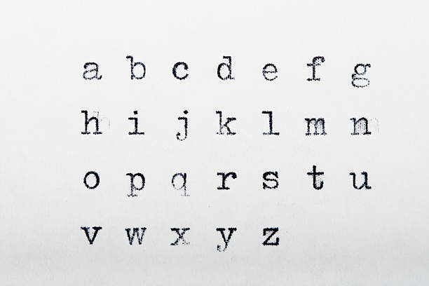
Font design: principles for readable and expressive type
Good font design balances aesthetics and function to make text both attractive and legible. Designers consider letterforms, spacing, and context to ensure that fonts support the intended message. Whether for print, web, or interface work, understanding how typography interacts with layout and content helps create clear, effective communication.

What makes effective fonts?
Effective fonts combine clear letterforms, consistent proportions, and thoughtful spacing. Key technical aspects include x-height, stroke contrast, and aperture shape; these influence how quickly readers recognize characters. Open apertures and larger x-heights improve legibility at small sizes, while consistent rhythm among letters supports even reading. A well-drawn typeface also accounts for diacritics, punctuation, and the full range of glyphs needed for its intended languages. Beyond mechanics, effective fonts fit the voice of the message: a legal report demands a different tone than a lifestyle magazine, and that tonal suitability should inform design choices.
How does typography shape readability?
Typography controls how text is presented and how easily it can be scanned. Line length, leading (line spacing), and tracking (letter spacing) work together with the chosen font to create comfortable reading rhythms. Short line lengths can increase readability in mobile contexts, while longer lines may suit printed columns. Proper hierarchy—distinct weights, sizes, and styles—guides readers through headings, subheads, and body text without overwhelming them. Attention to kerning between specific character pairs prevents distracting gaps, and consistent alignment supports predictable eye movement across a page or screen.
How do fonts affect body text?
Fonts used for body text must prioritize continuous readability over decorative detail. Serif typefaces have small strokes that can aid the eye in long passages on print by creating a horizontal flow; sans-serif faces often perform better on low-resolution screens due to simpler forms. Weight choices and x-height influence perceived density: heavier weights or small x-heights can tire the eye, while a well-proportioned regular weight typically works best for sustained reading. Consider also the medium—print ink spread changes letterforms slightly, and responsive web typography needs scalable sizes and variable metrics to adapt across devices.
How does design influence font choice?
Design context heavily influences which fonts work best. Brand identity requires type that supports personality—trustworthy, playful, or technical—without compromising clarity. Pairing typefaces involves choosing complementary families for headings and body text, often combining contrast (e.g., a geometric sans with a humanist serif) while maintaining visual harmony. Practical considerations include licensing (desktop vs webfonts), language support, and performance: web fonts should be optimized for loading speed. In interface design, readability under various screen conditions, legibility at small sizes, and clear distinction between interactive text and static copy are critical.
When should you choose serif styles?
Serif styles are appropriate when the design benefits from a traditional or formal tone, or when lengthy printed text requires subtle guides along reading lines. Serifs can increase perceived density and craft a sense of authority in editorial, academic, or financial contexts. However, modern serif designs and slab serifs also appear in branding where distinctiveness matters. On screens, a careful choice of a higher x-height and simpler serifs helps maintain clarity. Testing in the intended medium—print proofs or responsive previews—clarifies whether a specific serif family supports or hinders the reading experience.
Conclusion
Good font design is a practical art: it responds to technical constraints—size, medium, language support—while aligning with the communicative goals of a project. Successful typographic decisions start with defining purpose, then evaluating candidate typefaces for legibility, tone, and technical fit. Designers should prototype text in real contexts, check spacing and hierarchy, and adapt for accessibility by considering contrast and scalable sizes. Pairing fonts requires balance: contrast for structure, cohesion for a unified voice. Ultimately, clear, intentional choices in fonts and typography lead to text that not only looks right but functions effectively for readers.


