Font Design: Principles for Typography, Text, and Serif Use
Good font design balances practical readability with expressive character. Whether you are selecting type for a website, designing a printed brochure, or commissioning a custom typeface, understanding how fonts interact with layout, text content, and medium is essential. This article explains core principles behind effective font design and how choices about typography, serif styles, and overall design affect communication and user experience.

How do fonts affect readability?
Fonts influence how quickly and comfortably readers can process text. Letterforms that are well-proportioned, with consistent stroke widths and clear counters (the enclosed spaces in letters like o, e, and a), reduce visual strain. Readability depends on factors such as x-height (the relative height of lowercase letters), letter spacing, and contrast between strokes; typefaces designed for long passages often prioritize moderate contrast, generous x-heights, and open shapes to aid continuous reading.
Display fonts, meant for headlines or branding, can be more ornate because they are read at larger sizes and for shorter durations. For body text, designers often select fonts that maintain clarity at small sizes and across different screens or print qualities. Testing fonts at actual reading sizes and in the intended medium helps reveal issues like cramped spacing or poor letter distinction that can hinder comprehension.
What is typography’s role in layout?
Typography organizes information and guides the reader’s eye through a page or screen. Good typographic hierarchy uses variations in size, weight, spacing, and alignment to signal relationships between headings, subheads, and body text. Consistent use of grid systems and margins establishes rhythm and helps maintain a balanced visual flow, while typographic scale—choosing harmonious size ratios—reinforces the structure of content without overwhelming it.
Beyond hierarchy, typography also affects tone: condensed, high-contrast types can feel formal or dramatic, while rounded, humanist types often read as approachable. Accessibility considerations—such as sufficient contrast between text and background and appropriate line length—are part of typographic decisions and help ensure content is usable for a wider audience.
How does text context shape font selection?
The nature of the text—its purpose, audience, and medium—should drive font choice. Informational or instructional content benefits from neutral, highly legible typefaces that minimize distractions. Editorial or literary works may prioritize typefaces with classic proportions that support longer reading sessions. Short, punchy marketing messages can make use of more distinctive fonts to capture attention, provided they remain legible at intended sizes.
Context also includes technical constraints: screen-rendering behavior, language support (diacritics, glyph sets), and performance considerations for web fonts. When text will appear on multiple platforms, selecting fonts with reliable cross-platform rendering and adequate character coverage reduces surprises. For multilingual projects, choose families that include necessary scripts and maintain consistent visual weight across languages.
What design considerations guide type choices?
Type selection should respond to both functional and aesthetic goals. Functional aspects include legibility, appropriate weights and styles, and scalability. A versatile type family with multiple weights and italics can simplify layout decisions and maintain visual cohesion. Aesthetic aspects include personality and alignment with brand identity: is the voice formal, playful, technical, or warm? The chosen type should support that voice without compromising readability.
Technical design choices also matter: consider hinting for screen clarity, OpenType features for typographic richness (ligatures, alternate characters), and variable font options for flexible weight and width control. Collaboration between designers and developers during font integration can prevent performance issues and ensure typographic intent is preserved across responsive layouts.
When should you choose serif styles?
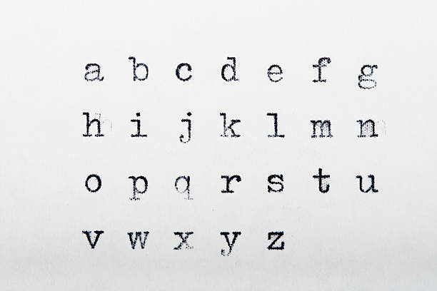
Serif typefaces include small strokes or “feet” at the ends of letterforms. They are often associated with tradition and formal publications, and many readers find carefully designed serif faces comfortable for long blocks of printed text because the serifs can help guide the horizontal flow of reading. In contrast, on some low-resolution screens or very small sizes, serifs can blur and reduce clarity, so sans-serif options are sometimes preferred for digital interfaces.
Choosing a serif should depend on context and testing: for printed books and long-form editorial content, a well-crafted serif can improve legibility and impart a classic tone. For modern, minimalist branding or compact UI elements, a clean sans-serif might work better. Many contemporary projects use mixed approaches—serif for headings and sans-serif for body text—to combine character with on-screen clarity.
Conclusion
Font design is a blend of visual craft and practical problem-solving. Thoughtful choices about typefaces, typographic hierarchy, and serif usage shape how text communicates and how audiences perceive content. Balancing aesthetic goals with legibility, medium-specific constraints, and accessibility results in typography that supports both meaning and reading comfort. Regular testing across real content and devices helps ensure those choices work in practice, not just in theory.


